Challenge
This was the core challenge of this project: how could we design an intuitive, high-quality product while ensuring efficient execution within tight deadlines?
Solution
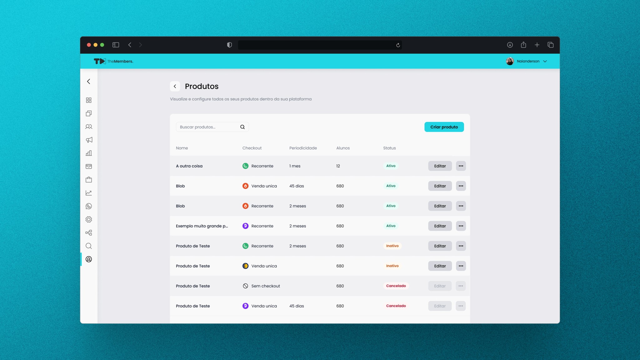
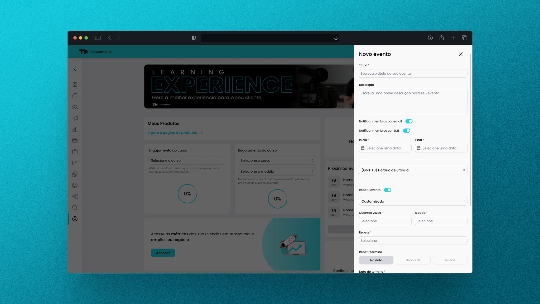
We focused on the core user experience by prioritizing the top three user flows that drove 80% of engagement, reducing scope creep and aligning design efforts with impact. By leveraging an existing design system and reusing over half of UI components, we maintained consistency while cutting front-end implementation time by 40%.
Strategic trade-offs—like deferring low-impact micro-interactions—helped us stay lean and focused on what mattered most for launch. Working in two-week sprints with early testing enabled us to identify usability issues faster, ensuring continuous iteration and refinement throughout the design and development process.
Results
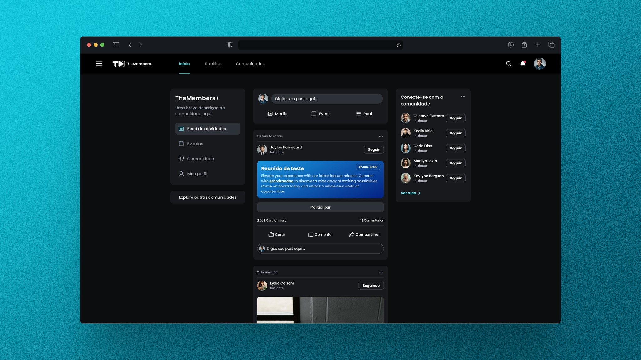
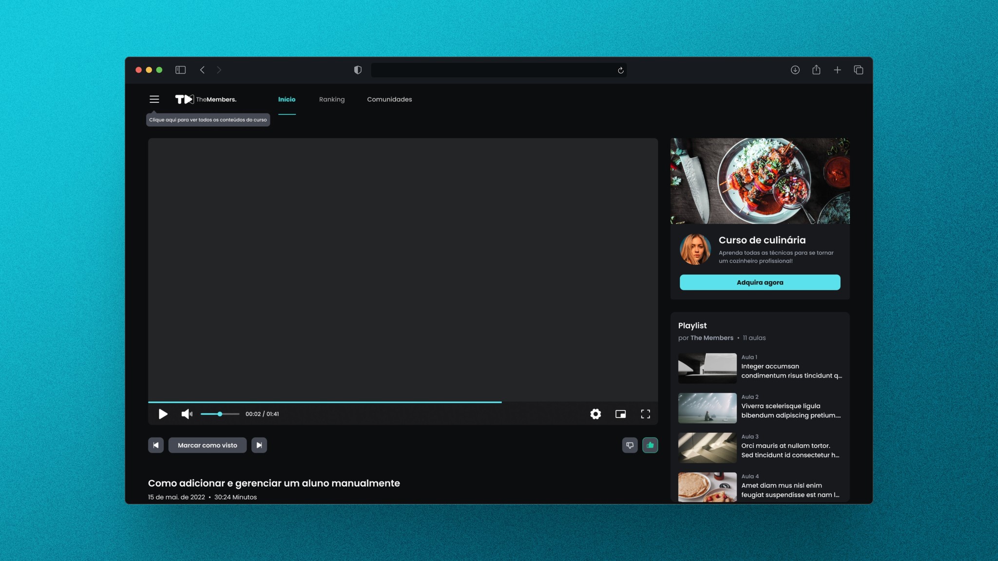
The implementation of our design system proved to be a true game-changer. With over 50 components, it achieved an exceptional 100% adoption rate across teams. This led to a 45% increase in speed and productivity, ultimately saving the company over $300,000 in engineering and design costs.
Every feature released post-launch saw immediate traction, with 32% of users engaging in the first two weeks alone. Continued improvements based on user feedback resulted in an average engagement boost of 8% after each iteration.
Over the years, this consistent and impactful work positioned the platform as the category leader in its niche in Brazil. Even more notably, it pioneered a new market segment—introducing educational content in a format that inspired a wave of similar initiatives. This innovation sparked a trend, with many competitors emerging, effectively changing how content and education intersect in the digital space.