Scroll down
FINTECH
In the app, there is a feature that allows you to manually close the tax year when it finishes. For example, in the US, the tax year finishes on December 31st. Both the accountant and the user can request to close the tax year, and both need to confirm the request.
⚡ Challenge
At first, I was told to put this feature in the personal folder, similar to Google Drive for users' uploaded documents. Later on, I was instructed to relocate it to the navigation bar. In my view, neither spot is really optimal for this feature. That's why I started an information architecture research to figure out where users would naturally look for it.
I've been given the exciting opportunity to develop a brand new product for a US-based company. This product is a cutting-edge tax management application designed for the web. Imagine it as an accountant's virtual office, catering to two types of users: clients looking to file their personal or business taxes, and a team of accountants ready to assist these clients.
✅ Solution
I recruited 25 users with experience in financial apps and strong technical skills. 80% agreed with placing the feature in the navigation bar or settings, while 20% (5 people) had different views - one person got confused and four chose other pages. In the A/B test, 60% preferred it in the navigation bar, against 40% who would like to find it in the settings.
Given that the results were 60% in favor and 40% against, I decided to combine both approaches. The data suggests that users expect to find the feature in both the navigation bar and the settings, and there isn't a significant difference between the percentages.
🚀 Results
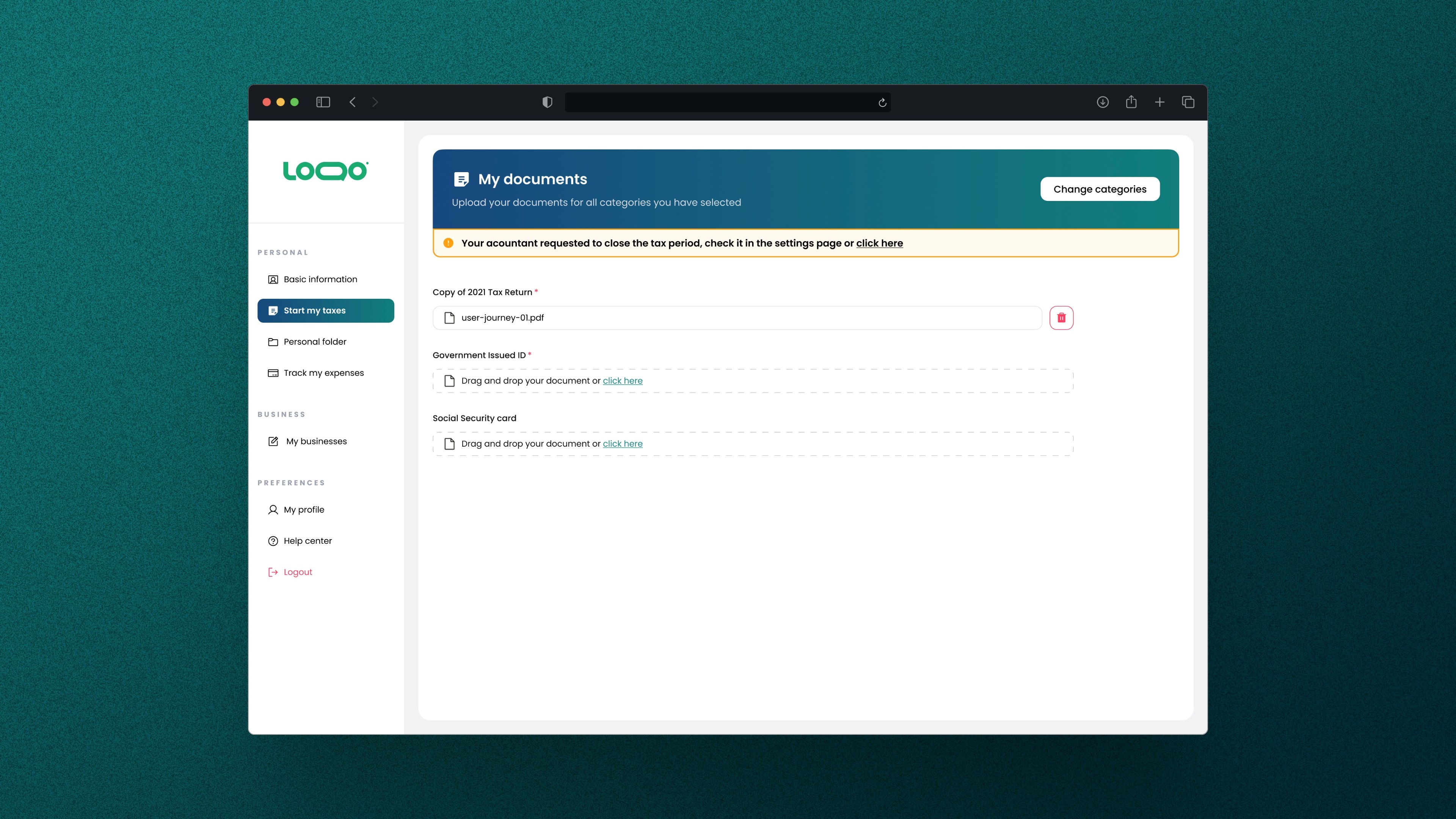
Noticing that 60% preferred the navigation bar for ease of access, I placed the feature as an alert bar below the homepage header when requested by an accountant—more effective than a random button in the navigation. I also kept it inside the settings for users who want to request it themselves.
In the next sprint, I ran another round of research to validate the iteration. The results showed a significant improvement—error rates dropped from nearly 40% to 0%, meaning all users were able to find the feature easily.
📄 Context


Tax Card

Button Component

Koombea

Destructive Modal