The Problem
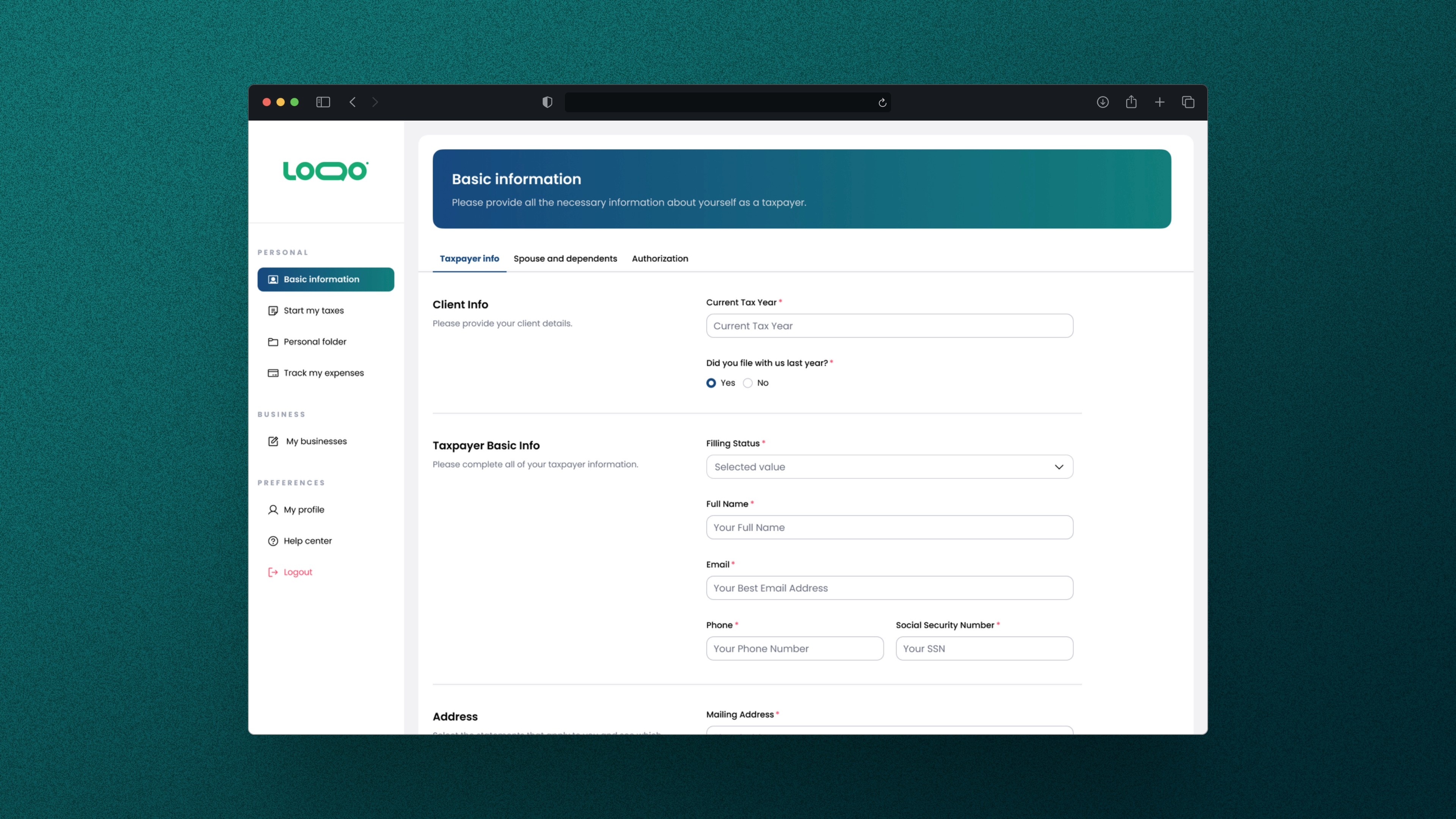
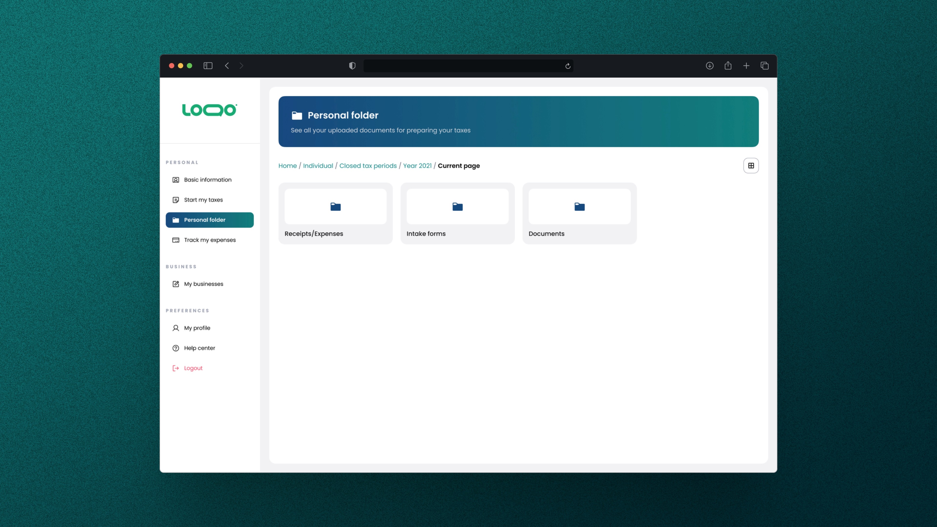
At first, I was told to put this feature in the personal folder, similar to Google Drive for users' uploaded documents. Later on, I was instructed to relocate it to the navigation bar. In my view, neither spot is really optimal for this feature. That's why I started an information architecture research to figure out where users would naturally look for it.
Research Process
I created a survey with two sections: information architecture and user preference. Participants were given context about the app and feature, along with an IA map to help them decide where they’d expect to find the "close tax period" option. I also included an A/B test with two videos showing different placements for the feature.
I recruited 25 users with experience in financial apps and strong technical skills. 80% agreed with placing the feature in the navigation bar or settings, while 20% (5 people) had different views - one person got confused and four chose other pages. In the A/B test, 60% preferred it in the navigation bar, against 40% who would like to find it in the settings.
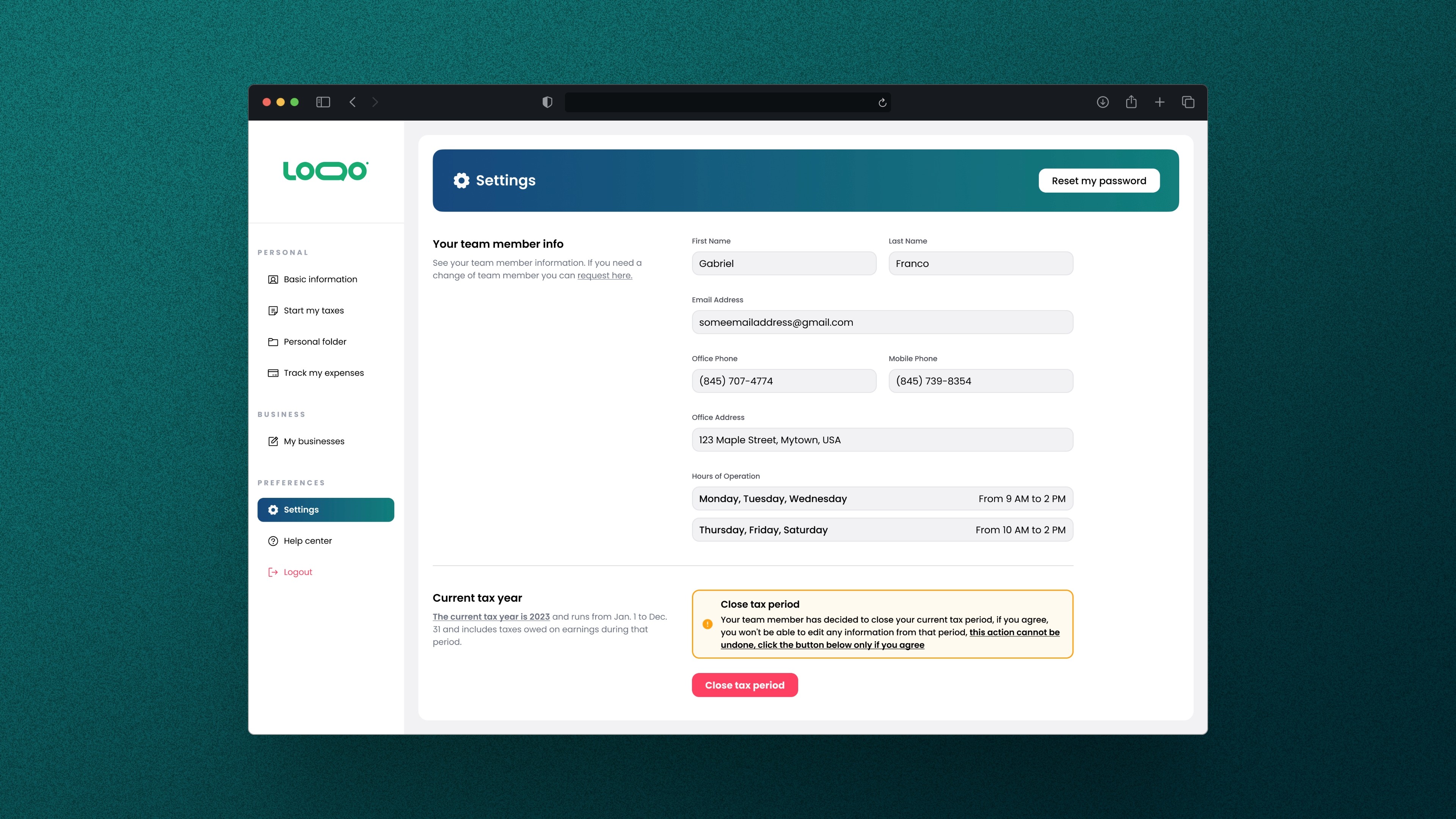
Results
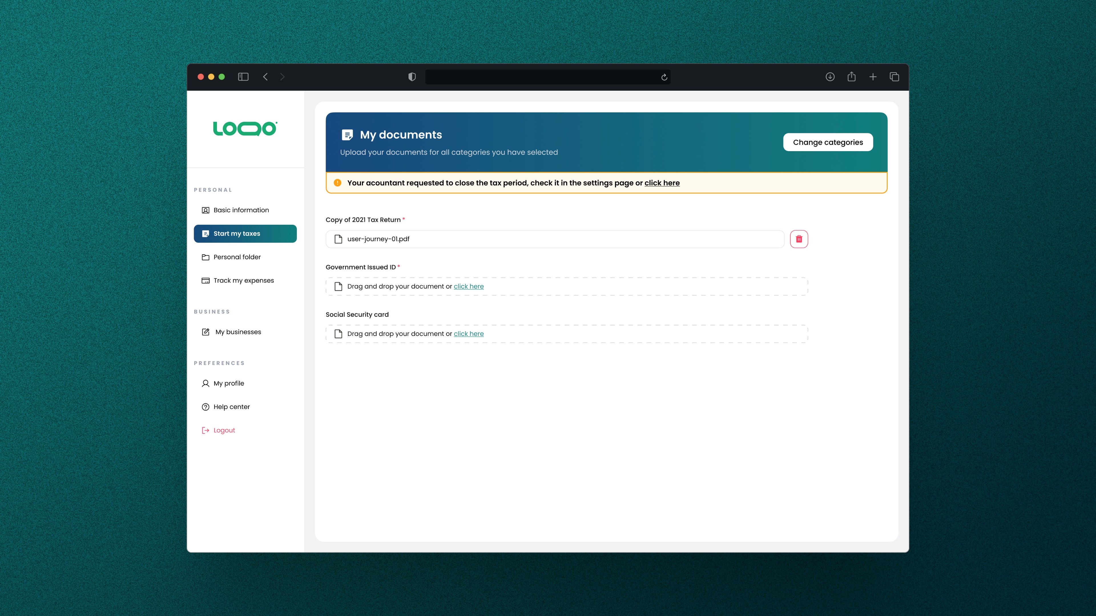
Given that the results were 60% in favor and 40% against, I decided to combine both approaches. The data suggests that users expect to find the feature in both the navigation bar and the settings, and there isn't a significant difference between the percentages.